Visualization Object Types
The following visualization object types can be used for displaying data in SysTrack Dashboard:
Grid
Used to show tabular or hierarchical data. If the data is hierarchical, and the Show Hierarchy if Present option is selected, the grid will show the +/- icons to allow parents to be expanded and collapsed to hide and show children.
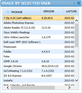
For more, see Grid.
Chart
Used to show data in standard graph formats such as line, bar, column, pie and area. The bound data must have one column for the X axis values, and one or more columns that define the Series or Y data values.
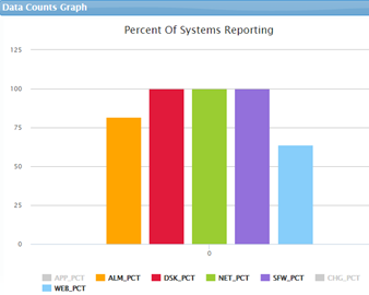
For more, see Chart.
Gauge
Dials or meters that enable the dashboard user to visualize an item’s data value. Can only show one value at a time and generally show either an average value, or a value from a selected row in a grid. For example, we could see what percentage of users have an excellent health score, how many concurrent users there are, how many systems are ready to be virtualized, or how many users have a selected package installed.
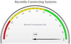
For more, see Gauge.
Horizon Graph
Used to present area graphs in a compact manner. Horizon graphs require a numerical or date-based domain and a numerical range, and are best used to show patterns and exceptions over a set of data. This type of graph is not well suited to displaying data that has large spikes that are drastically different in value from the rest of the data.
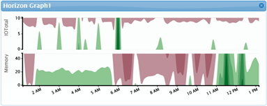
For more, see Horizon Graph.
Sankey Diagram
Used to show volume flow between entities. Each entity is displayed as a rectangle, with the link between two entities having a width proportional to its value. An example of the type of data that could be shown on a Sankey diagram is the volume of data transfer between entities on a network. In this case, the larger the data transfer, the greater the width of the link.

For more, see Sankey Diagram.
Heat Chart
Used to visualize a single data dimension using two axes in a circular layout. This type of chart is useful for showing cyclic data such as hours of the day during the week and makes it easy to identify clustered data values such as periods of peak usage. One of the axes, the segment axis, defines the pie-like wedges around the chart. The other axis, the radial axis, defines the concentric circles. The data value controls the color of the segments at the intersections of the two axes.
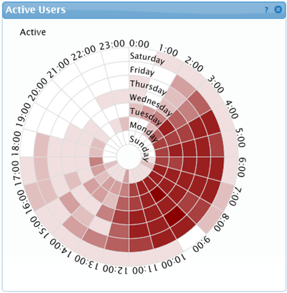
For more, see Heat Chart.
Bubble Diagram
Used to clearly show relative relationships between data values, for example file sizes or number of hits on various web sites. If the data is hierarchically ordered, the Bubble Diagram can also show the parent/child relationships, such as applications that make up a package.
Bubble diagrams can show two dimensions of data simultaneously. The size and color of a bubble can both be tied to the input data - for example application memory usage tied to the size of the bubble, and CPU usage tied to the color. A Range Slider can be attached to a Bubble diagram to control the ranges and colors.
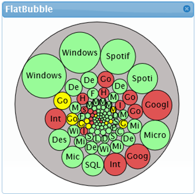
For more, see Bubble Diagram.
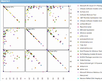
Matrix
Used to show a series in a block-based matrix to display and view data points in relation to others. The bound data must have one column for the name values, and one or more columns that define the series, or axis data values. The output from the matrix will be the set of rows matched against the matrix-selected object names.
For more, see Matrix.
Map
Used to show data on a geographic map with color-coded markers at specific latitude and longitude locations, or color-coded countries or regions.

For more, see Map.
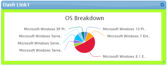
Dash Link
A Dash Link displays a visual representation of another dashboard that links to the selected dashboard when clicked on by the user.
For more, see Dash Link.
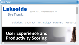
Web Page
Allows the display of external web content in a dashboard.
For more, see Web Page.
On This Page