Health Tool
Resolve's Health Tool lets you look at a selected system's health score (the service quality) over the past 30 days. You can easily compare the health score to trending data from Enterprise Visualizer, which maintains up to three years of history.
NOTE: The Health tool is not available for servers.
As a best practice, you can use the Health tool as the first place to start looking for issues. For example, if a user calls the help desk to report that their system is slow, you can use this tool to quickly answer questions, such as:
-
How long ago did the service quality begin to decline?
-
Is there a continuous negative impact or a sporadic impact?
If you find that an element has a high level of impact on the system's health, you can then use other Resolve tools to further research the issue. For example, if the Health tool indicates that application faults are having a high impact on system health, you could use the Black Box tool to determine which applications were active at the point in time when faults were having the highest impact on system health.
To get started with this tool, select a focus user, configure a Time Window for the data that displays on this page, and then proceed with the following sections.
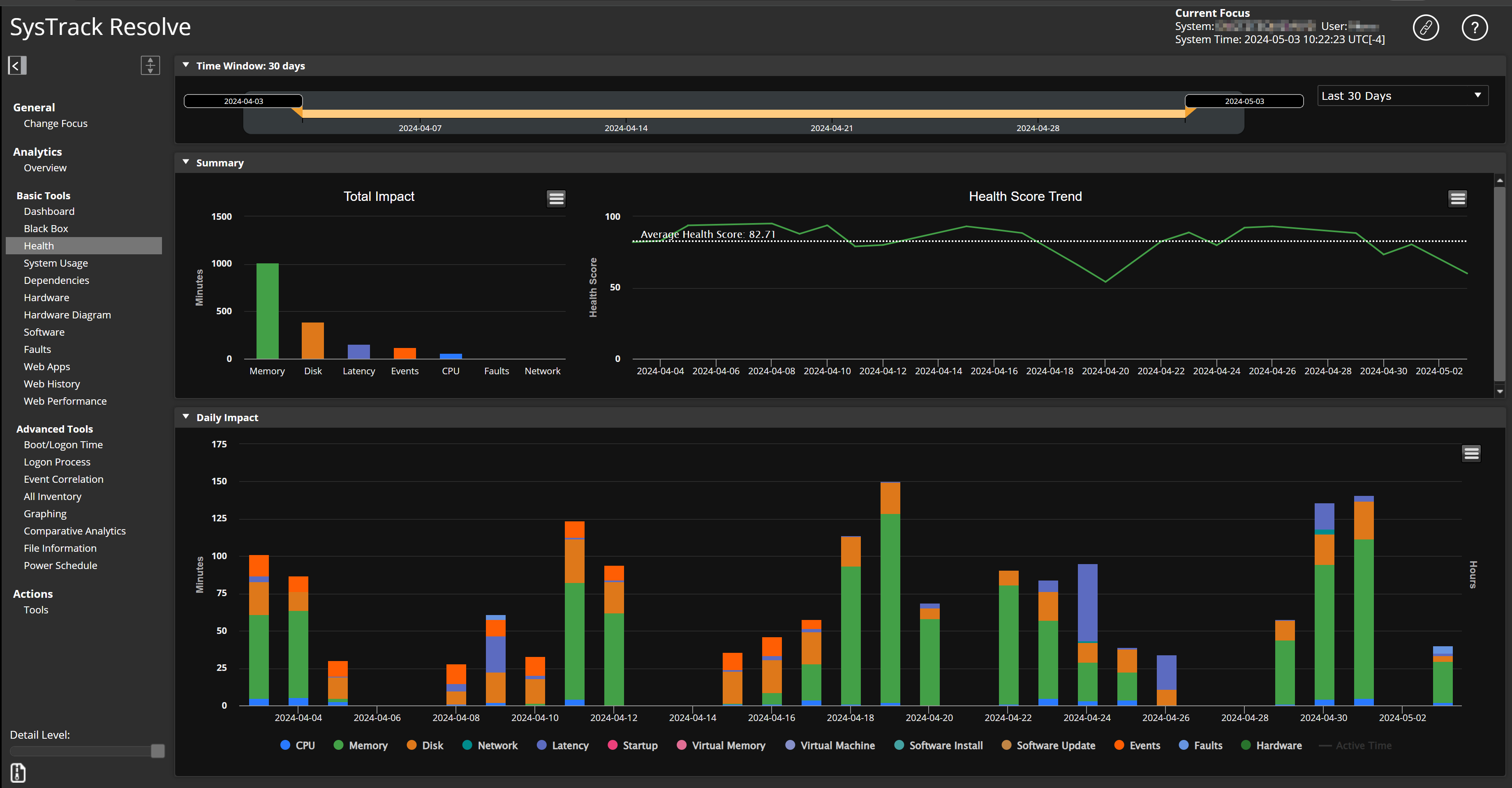
Total Impact Chart
The Total Impact chart breaks out the categories that have impacted the system's performance. The value displayed for each category is the total number of minutes that the category has impacted the system's performance over the last 30 days.
For example, if you see that the Disk category in the chart contributes the most by far to the system's health impact, you can look at the Health Score Trend to put it into context. The Health Score Trend indicates very good system performance. Therefore, the Total Impact Chart's Disk level of 98.59 minutes over the last 30 days is not a cause for concern.
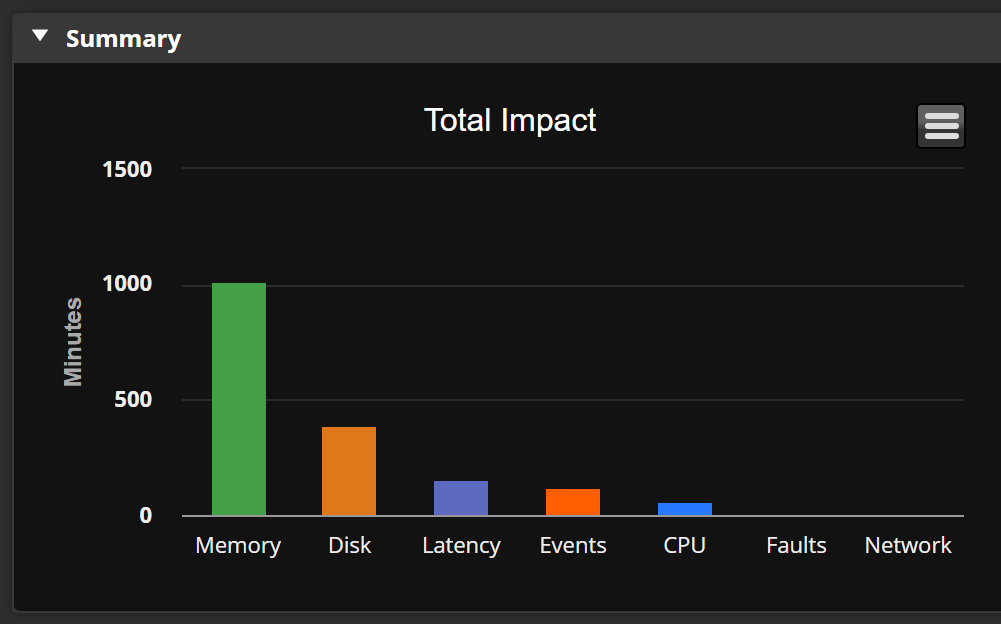
Health Score Trend Line Graph
The Health Score Trend line graph provides a quality trend over the focus time period. The closer the Health Score Trend is to 100 percent, the closer the system is to perfect performance health.
You can hover over the trend line to see details for that point in time.
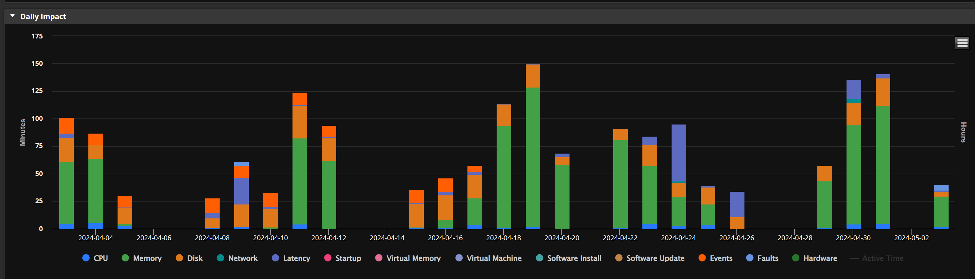
Daily Impact Bar Graph
The Daily Impact graph (along with the System Usage tool's System Usage pie chart) break out the categories that have impacted the system's performance. The System Usage pie chart provides the total number of minutes that the category has impacted the system's performance over the last 30 days. The Daily Impact bar graph shows the impact minutes for each category over time.
The bars at each date point are broken into color-coded category segments. Hover over a category segment to display the category's impact minutes for the indicated date.
On This Page