System Usage Tool
Resolve's System Usage tool shows you a graphical summary of a selected system's utilization over the past 30 days.
NOTE: The System Usage tool is not available for Servers or Terminal Servers.
To get started with this tool, select a focus user, configure a Time Window for the data that displays on this page, and then proceed with the following sections.
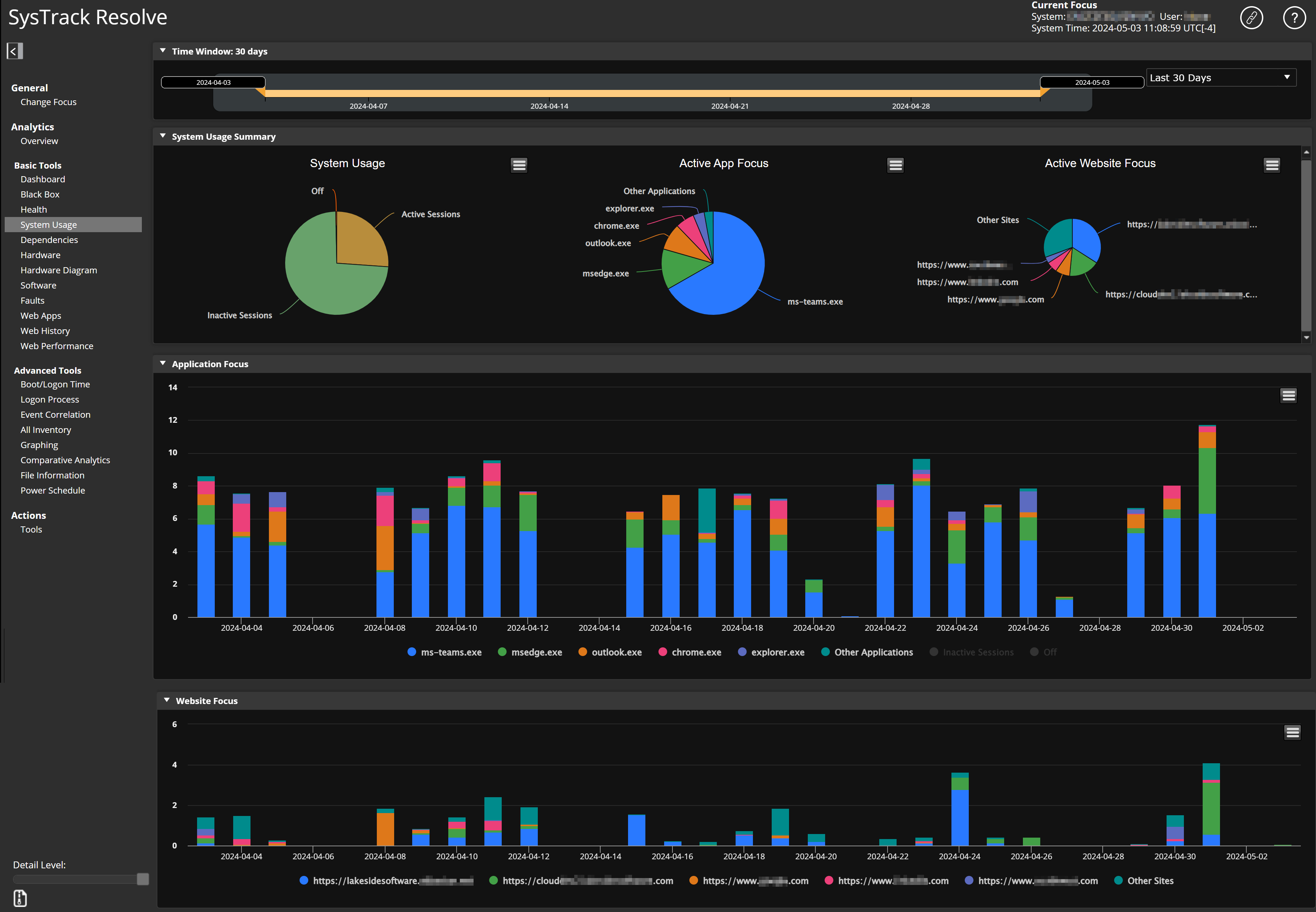
System Usage Pie Chart
The System Usage pie chart breaks out the categories of system usage for your selected focus time period. It also shows a usage percentage for each category.
TIP: If a user rarely turns off their system, System Usage will show a large percentage of time dedicated to Inactive Sessions.
Hover over a piece of the pie chart to see exact the exact percentage.
Active App Focus Pie Chart
The Active App Focus pie chart shows the applications that have been in use (while the system was active) for your selected focus time. You can quickly look at this chart and determine which applications are worked with most frequently.
Hover over a piece of the pie chart to see exact the exact percentage.

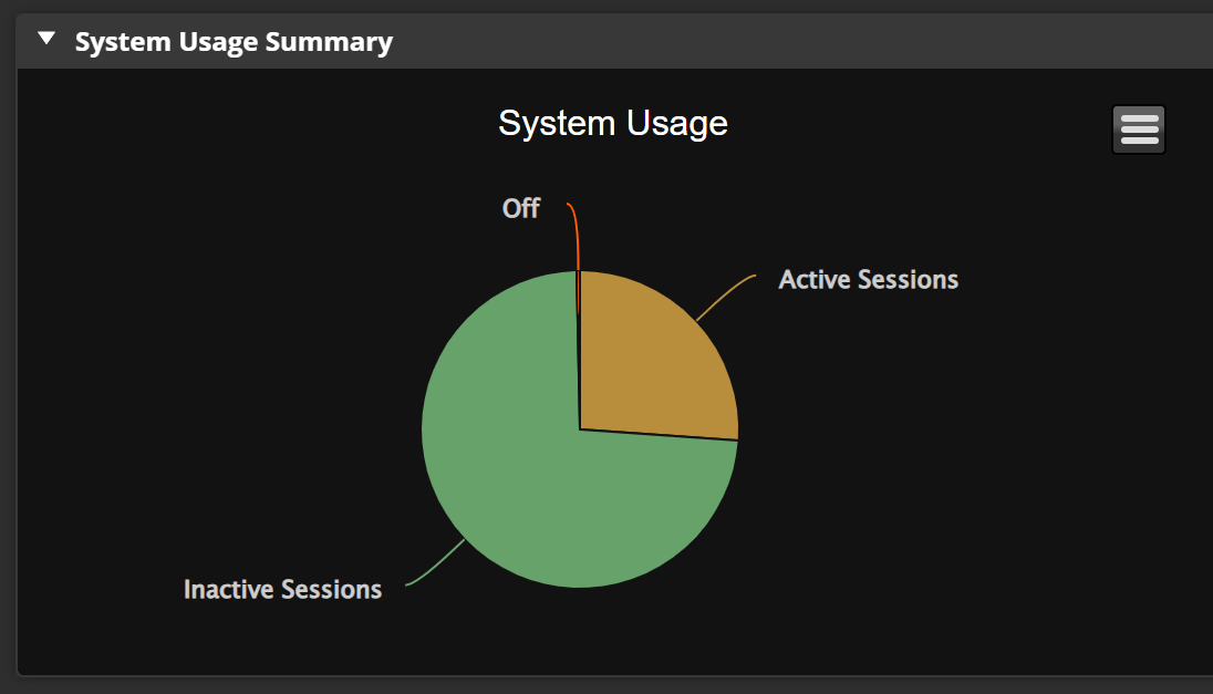
Active Website Focus Pie Chart
The Active Website Focus pie chart appears only if the selected system's agent has website collection enabled (through the Deployment Tool). The pie chart shows the websites the user has visited. You can quickly look at this chart and determine which websites the user spends the most time on.
NOTE: Web data collection can be disabled (through the Deployment Tool) to conform with privacy policies when applicable.
Hover over a piece of the pie chart to see exact the exact percentage.
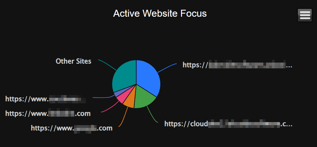
Application Focus Bar Graph
The Application Focus bar graph (along with the Active App Focus pie chart) break out the applications that have been in use. The Active App Focus pie chart provides the percentage of time that the application was in focus while the system was active for your selected time window. The Application Focus bar graph shows the amount of time the application was in use for each day in your selected time window.
The bars at each date point are broken into color-coded application segments. Hover over a bar to see which applications were in use that day and the amount of time they were in use.
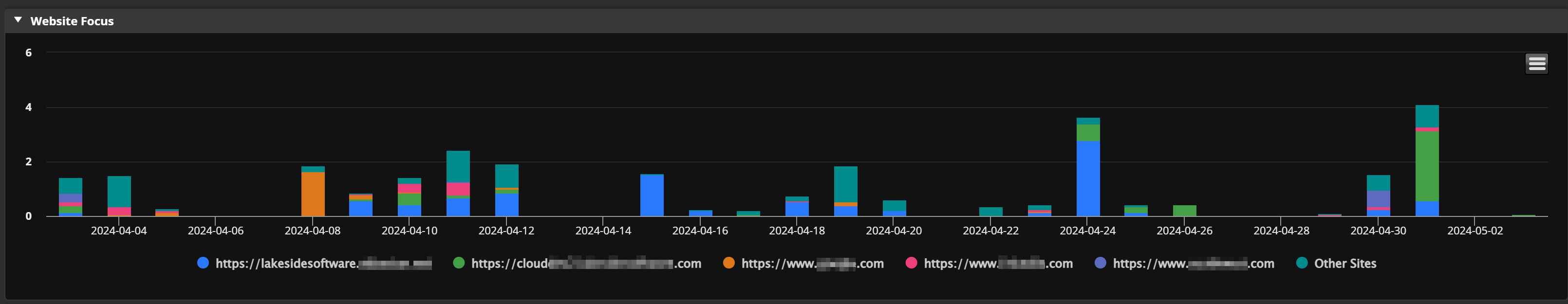
Website Focus Bar Graph
The Website Focus bar graph appears only if the selected system's agent has website collection enabled (through the Deployment Tool).
Both the Active Website Focus pie chart and the Website Focus bar graph break out the websites that have been visited. The Active Website Focus pie chart provides the percentage of time that the website was in focus for the chosen time window. The Website Focus bar graph shows the amount of time the website was in use for each day in your selected time window.
The bars at each date point are broken into color-coded website usage segments. Hover over a bar to see which websites were in use that day and the amount of time they were in use.
On This Page