Home >
Available Chart Series Types
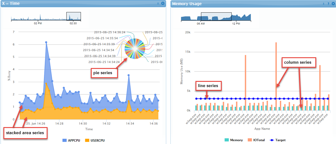
The following chart types (examples of which are shown below) are available for use in a series when defining a Chart in SysTrack Dashboard:
- Line: Useful for comparing non-cyclical data for showing trends over periods of time
- Column: Useful for comparing several items in a specific range of values
- Bar: Useful for comparing several categories of data. Most often used for a single point in time
- Area: Useful for clearly illustrating the magnitude of change between two or more data points
- Stacked line: Useful for analyzing data with different units of measure
- Stacked column: Useful for comparing items in a specific range of values as well as showing the relationship of individual sub-items with the whole
- Stacked bar: Useful for comparing more complex categories of data
- Stacked area: Useful for comparing data that changes over time and where relative and absolute differences matter
- Pie: Useful for representing the distribution or proportion of each data item over a total value
- Scatter: Useful for showing correlations between two sets of values
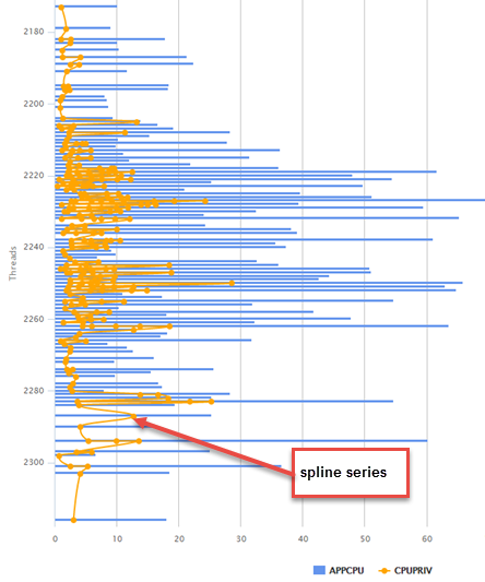
- Spline: A curved line chart that draws a fitted curve through data points. Useful for showing smooth gradual changes instead of spikes


On This Page