Adverse Impact of Changes
The Adverse Impact of Changes page gives you another way to approach Root Cause Analysis: You can use this page to see common changes that were made and the sensors that were activated around the time of the changes.
The page is made up of three sections: Common Changes, Related Sensors, and Change Details. You can expand or collapse each section, as well as click and drag the section borders to re-size the sections. Click a column in a section to sort the data by that column.
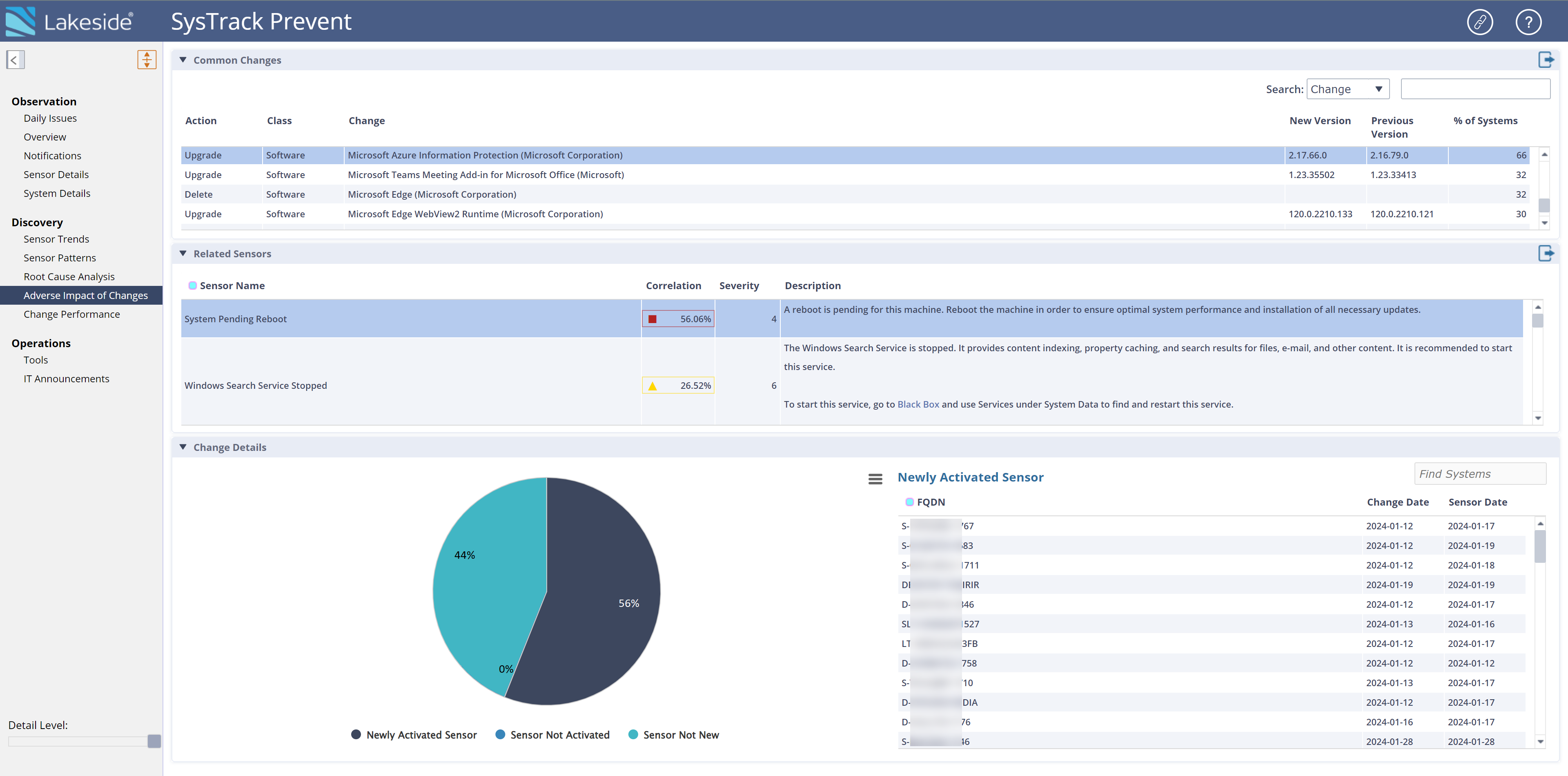
EXAMPLE: You view the Adverse Impact of Changes page. In the Common Changes section, you select a change that upgraded Microsoft Azure Information Protection on 66 percent of systems. The Related Sensors section loads a list of the sensors that activated shortly after that change on any of those 66 percent of systems. You see that the System Pending Reboot sensor activated on 56.06 percent of the machines. If this percentage was lower and displayed in yellow or green, it would be unlikely that this sensor activated due to the Microsoft Azure Information Protection upgrade. However, because the Correlation column is red instead of yellow, it likely warrants deeper investigation into whether the sensor activated due to this change.
For the systems with this change, the pie chart in the Change Details section shows you that the System Pending Reboot sensor was activated on 44 percent of systems prior to the change, while 56 percent of systems had it activated shortly after the change, and 0 percent of systems do not have the sensor active at all.
Common Changes
The Common Changes section shows the most recent changes across all systems. When you select a change in this section, the Related Sensors section displays the sensors that were activated on systems after that change. The % of Systems column shows you how many systems each change affected. The Search field in this section enables you to search the Class column or the Change column to quickly find the change you want to see.
TIP: When you search, the default limit for how far back your search looks is 90 days.
You can click the Export button to export the Common Changes table.
Related Sensors
Based on any change you select in the Common Changes section, the Related Sensors section updates to show you the sensors that were activated on the seven days after the change occurred.
The Description column explains what each sensor is designed to indicate.
For each sensor listed, the Correlation column displays the percentage of the systems that experienced your selected change and also had that sensor triggered on those seven days. A red square in the Correlation column draws your eye to percentages that are high enough that they warrant deeper investigation. A yellow triangle indicates lower percentages that you might want to prioritize lower than red. A green circle indicates that the percentage is very low and unlikely to be important to your investigation.
You can click the Export button to export the Related Sensors table.
Change Details
The Change Details section shows a pie chart that provides details for these categories:
-
Newly Activated Sensor: Systems in this category had the selected sensor newly activated during the seven day window after the change was made.
-
Sensor Not New: Systems in this category had the selected sensor activated before the seven day window.
-
Sensor Not Activated: Systems in this category received the selected Common Change, but they did not have the selected sensor activated in the seven day window.
Hover over each category in the pie chart to see a tool tip of details. Click each category to change the table next to the pie chart.
EXAMPLE: You click Newly Activated Sensor on the pie chart. The table changes to Newly Activated Sensor and displays the systems that had the selected sensor newly activated during the seven day window after the change was made, the date the system received the change, and the date that the sensor activated. The system identifier is listed in the FQDN column.
Use the Search field in the Change Details section to search the FQDN column and more easily find a system you want to see.
Click the Chart Context Menu button to see a menu of options for the pie chart. You can view it in full screen or print it. You can also download it as PNG, JPEG, PDF, SVG, and CSV.
On This Page